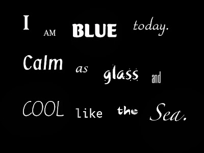


I chose the specific fonts and the way I arranged the words based on how I thought the words would be described. "I" and "am" in my opinion were words that did not need to be emphasized so they were left a white color and typed in the font Waters Tilting Pro which was simple. "Blue" was the most important word in the font poem as it was describing the main theme. Therefore I typed it in the Mercurius CT Std font and made it a bright blue color. I wanted this word to stand out so I warped it and used the upper shell style along with an inner glow special effect. "Today" also was not a word that needed to be emphasized so it was left white and typed in the simple Park Avenue Std font.
"Calm" needed to stand out, and it needed to describe exactly what it stated, calm. I typed this word in the Klang MT Std font and made it a light blue color which is a color that is calming to me. "As" was also not a word that needed to be emphasized so it was left white and typed in VAG Rounded Std font. "Glass"was a very important word in this font poem. I typed the word glass in Khaki Std font and chose the second option of this font. The first option was plain and simple, as the second option included the speckles surrounding the word. I thought the speckles added a nice touch as it reminded me of small pieces of broken glass.
"And cool like the sea." was constructed all as one so that I could make it look like a wave in the ocean. I would have done this effect with just the word "sea", but using just one word was too short and it did not emphasize what I was trying to show. I needed a long phrase of words to get the point across. I typed this phrase in Nuptial Script LT Std making the font bigger in size as I typed each word. I did this because in the ocean a wave gets bigger as it hits the shore. I thought the font choice went well with the image of a wave as it was curly on the ends and almost looked like a wave crashing on the beach. I added the wave like effect by clicking on the effect symbol on the font tool bar and clicking on flag. This gave the phrase that wave-like effect. Then I could adjust the bend, and the vertical and horizontal distortion of the phrase. I also used a gradient overlay affect of light blue and white to make it a two-tone font. I did this because it reminded me of how waves in the ocean also look two-toned and have highlights because of the reflection of the sun on the water.
Some problems I encountered were trying to find a font that did not make the word "glass" look like "class". I wanted to make sure the font was easy to read and understand by the viewer so that they could feel the message of the quote without having to think and figure out what the quote actually says. I solved this, just by trying out numerous fonts until I found one that fit. Also, I had an issue with getting "and cool like the sea" to fit the way I wanted it. It took a while to play around with the magnitude of bending the phrase and the sizes I used for each word to make it look the way I wanted.
If I had more time, I would maybe try to use some different fonts and figure out a way to shorten the number of words used in the "and cool like the sea" but still get that wave like affect. However, I still think it came out pretty good, and I am proud of how it all came together. Each word as it stands by itself is not very impressive, but when it comes together, all of the words complement each other nicely and they work together to portray the calm, blue, ocean-like theme.
No comments:
Post a Comment