Tuesday, September 29, 2009

Collage Design Rationale


I constructed this collage by combining many different images on different layers. I began by finding an image of waves and using it as my background for the collage. I copied and pasted the image of waves into a 640 pixels by 480 pixels new document. Then I resized the image by clicking on edit and then free transform. I held the shift button and used the mouse and arrows on the screen to adjust the image the size I wanted.
Once the background image was in place on layer one I began putting together the various images of different body parts that I brought together to form an image of me. I used an image of my feet, hands, legs, and face while using images of other peoples torso, arms and funny glasses. I copied and pasted each of these images one at a time into the new document and placed all the images on different layers over the background image. I resized and adjusted each image individually by again clicking on edit and free transform and holding shift while I used the arrows to adjust the size. Then I used the move(arrow tool) to move the images to where I wanted them in the collage.
Once all of the images were sized and placed in their correct positions. I clicked on the top layer, hit shift, and then clicked on the second to last layer right before the background image. Then I clicked on form new group with layers and named the group corpse. Then I opened the corpse group folder and again selected all of the layers by clicking on the first, then holding the shift button, then clicking on the last. Then I clicked on merge layers. After the body part images were merged onto one layer I adjusted the hue and saturation to the color of my desire.
Once I did this, it appeared that the entire image's hue and saturation was altered. To fix this I hit the option key on the keyboard and clicked between the merged layers and the background layer. Then the background image appeared its original color and the merged layers all had a yellowish-blue hue/saturation. Lastly, I made the merged layers have a vivid light effect and adjusted the opacity until it was complete. Then the image was saved as a .psd and a .jpeg under the name collage.
To make the animation in photoshop, I had to have the font poem open with all layers visible. Then I opened my collage jpeg document and clicked select all and copied and pasted it into the font poem photoshop document as a new layer. Then I clicked on window and then animation for the animation tool bar to be visible in photoshop on the bottom of the screen. To control what appears in the animation slides the eye button next to each layer can be clicked or un-clicked. To make a new slide I clicked on the new slide button at the bottom of the toolbar and made sure the eye was clicked off from the previous slide.
I animated my font poem and collage so that one word or a group of words appear at a time depending on what I was trying to emphasize. I did want 'and cool like the sea' to come in at different times, but was unable to do so because all of the words were merged on the same layer. At the end I had the font poem over the collage. I needed to change the position of some of the font so that parts of my collage, like my face were not covered. I also had to change the time intervals between the slides so that the animation was slow enough to actually read the words that were on the screen.

Wednesday, September 23, 2009

Font Poem Design Rationale


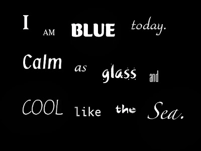
I chose this saying for a couple of different reasons. The first reason I chose this quote was because I thought it was a good representation of who I am. I am definitely a lover of the ocean, and my favorite color is blue because it is calming and laid back. The second reason I chose this quote was because it had very descriptive words all pertaining to the same idea in which I could focus on one main theme of the font poem rather than many different themes.

I chose the specific fonts and the way I arranged the words based on how I thought the words would be described. "I" and "am" in my opinion were words that did not need to be emphasized so they were left a white color and typed in the font Waters Tilting Pro which was simple. "Blue" was the most important word in the font poem as it was describing the main theme. Therefore I typed it in the Mercurius CT Std font and made it a bright blue color. I wanted this word to stand out so I warped it and used the upper shell style along with an inner glow special effect. "Today" also was not a word that needed to be emphasized so it was left white and typed in the simple Park Avenue Std font.

"Calm" needed to stand out, and it needed to describe exactly what it stated, calm. I typed this word in the Klang MT Std font and made it a light blue color which is a color that is calming to me. "As" was also not a word that needed to be emphasized so it was left white and typed in VAG Rounded Std font. "Glass"was a very important word in this font poem. I typed the word glass in Khaki Std font and chose the second option of this font. The first option was plain and simple, as the second option included the speckles surrounding the word. I thought the speckles added a nice touch as it reminded me of small pieces of broken glass.

"And cool like the sea." was constructed all as one so that I could make it look like a wave in the ocean. I would have done this effect with just the word "sea", but using just one word was too short and it did not emphasize what I was trying to show. I needed a long phrase of words to get the point across. I typed this phrase in Nuptial Script LT Std making the font bigger in size as I typed each word. I did this because in the ocean a wave gets bigger as it hits the shore. I thought the font choice went well with the image of a wave as it was curly on the ends and almost looked like a wave crashing on the beach. I added the wave like effect by clicking on the effect symbol on the font tool bar and clicking on flag. This gave the phrase that wave-like effect. Then I could adjust the bend, and the vertical and horizontal distortion of the phrase. I also used a gradient overlay affect of light blue and white to make it a two-tone font. I did this because it reminded me of how waves in the ocean also look two-toned and have highlights because of the reflection of the sun on the water.

Some problems I encountered were trying to find a font that did not make the word "glass" look like "class". I wanted to make sure the font was easy to read and understand by the viewer so that they could feel the message of the quote without having to think and figure out what the quote actually says. I solved this, just by trying out numerous fonts until I found one that fit. Also, I had an issue with getting "and cool like the sea" to fit the way I wanted it. It took a while to play around with the magnitude of bending the phrase and the sizes I used for each word to make it look the way I wanted.

If I had more time, I would maybe try to use some different fonts and figure out a way to shorten the number of words used in the "and cool like the sea" but still get that wave like affect. However, I still think it came out pretty good, and I am proud of how it all came together. Each word as it stands by itself is not very impressive, but when it comes together, all of the words complement each other nicely and they work together to portray the calm, blue, ocean-like theme.


Tuesday, September 8, 2009

Contact Sheet Design Rationale

The first step in completing the first row of the contact sheet was to find a 1200 dpi (dots per inch) photograph online. In my case I used flickr.com. Once I found a photograph, I used Adobe Photoshop to re-size the image so that the height was 1 inch. Then I dragged the image into the contact sheet in the 1200 dpi section. The next step was to make the dpi or resoultion smaller. I changed the resolution from 1200 dpi to 600 dpi by clicking on image, and then image size. Within the image size table there was a smaller box that read: resolution 1200 dpi. I changed this to 600dpi, then to 300 dpi and then lastly to 72 dpi, saving and dragging the images into the contact sheet as the resolution of the images got smaller.

For the second row of the contact sheet I had to find a colorful picture online. Also using flickr.com I found an image, opened it in Adobe Photoshop and then changed the image size so the height was one inch. Then I dragged the RGB color photo to the contact sheet. Next, I changed the RGB color photo to CMYK color clicking on image, then mode, and then CMYK color. After that image was dragged to the contact sheet I had to change the photo back to RGB color also clicking on Image, mode, and then RGB color. After the image was changed back, I clicked on adjustments and made the photo black and white also dragging that image to the contact sheet. The last step was to make the image a duotone image. I did this by opening the original image again in RGB color, and clicking on image, mode and then grayscale, disregarding the color information. Then I clicked on image, mode and duotone selecting black and purple which were the two colors in which I wanted the image to appear. I saved ad a PDF and again dragged it to the contact sheet.

For the third row of the contact sheet I again, found an online photo on flickr.com. I opened the photo in photoshop and clicked on the crop tool. I first cropped the photo as a landscape photo with a height of 1 inch and a width of 1.5 inches. To crop the photo this way, I typed the dimensions I wanted into the crop tool boxes and dragged the curser over the image. Then I adjusted the selected area and double clicked to crop when I was satisfied with the look of the frame. Then I proceeded cropping with the same steps but this time making a square 1 inch by 1 inch and a portrait 1 inch by .75 inches. In between each crop I dragged the images to the contact sheet.

For the fourth row of the contact sheet I had to find a 300 dpi photo. I changed the height to 1 inch and width to 1.497. Then dragged the image to the contact sheet. Then I clicked on the crop tool. I preset the height to 1 inch and width to 1.479 inches. And cropped the image so that I cut some of it out completely and the rest of the image appeared closer or more zoomed in than before. I cropped and zoomed in on the image three more times, but dragging the images to the contact sheet between each alteration.

For the fifth row of the contact sheet I followed the same steps I had used for the fourth row. I found a 300 dpi photo and changed the height to 1 inch and width to 1.239 inches and dragged the image to the contact sheet. Then I clicked on the crop tool and preset the height to 1 inch and width to 1.239 inches. I cropped the image so that some of it was cropped out completely while the image that was left appeared closer or more zoomed in than before. I cropped and zoomed in on the image three more times, this time making the image look abstract for the final frame. between each crop each image was dragged to the contact sheet.

For the sixth row I found an online image of any resolution. I resized the image so that the height was 1 inch and dragged it to the contact sheet. Then I selected all of the photo and clicked filter, then artisitc and then palette knife. What I did was changed the photo to look like it was not actually a photo but a painted created with a palette knife. Then I dragged this image to the contact sheet. Then I used the original photo and did this two more times making one image have a crosshatch effect and the other having a paint daubs effect. Then I dragged these images to the contact sheet.